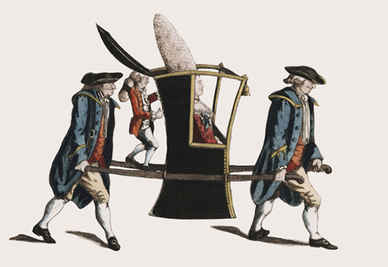
Rebecca and I couldn’t help but laugh at the wonderful image she is using in a new invitation design for the Lewis Walpole Library, which made me realize that in LWL’s communications, she uses recurring image treatment to build an individual look for the library.
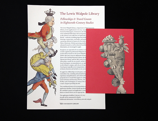
Located in Farmington, Connecticut, the LWL is the farthest outpost of the Yale University Library system. The library is a research center for 18th-century studies, focusing on British prints, drawings, manuscripts, rare books, paintings, and decorative arts.
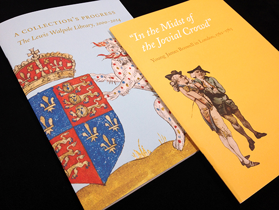
The illustrations—all selected from the LWL’s collections—are often playful, humorous, and always memorable. They are presented in silhouette against a solid-color background. Though this image treatment is simple, it creates a noticeable pattern across LWL communications.
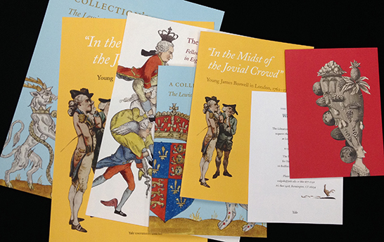
The resulting portfolio is visually cohesive, unique, and appropriate to this library.
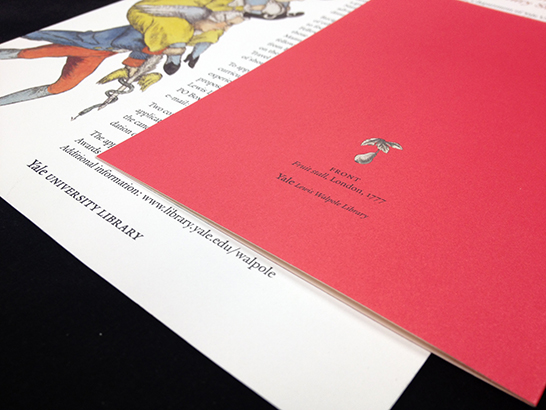
Notice that all of the material incorporates the Yale logo and frequently uses the Yale typeface as well. In so doing, the LWL has developed an individual character within the University’s branding guidelines.