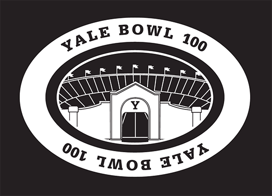
This week, the Athletics Department will unveil the logo for its centennial celebration of the Yale Bowl. When Athletics brought this project to our office, they requested that the logo capture the essence of the stadium in a nostalgic, but not old-fashioned, way.
-
 Title text
 -
 Title text
 -
 title txt
 -
 title txt
John and I conducted considerable image and architectural research. We examined the Bowl’s original blueprints in the Facilities office. We combed through Yale’s archives of sports ephemera for color and style inspiration.
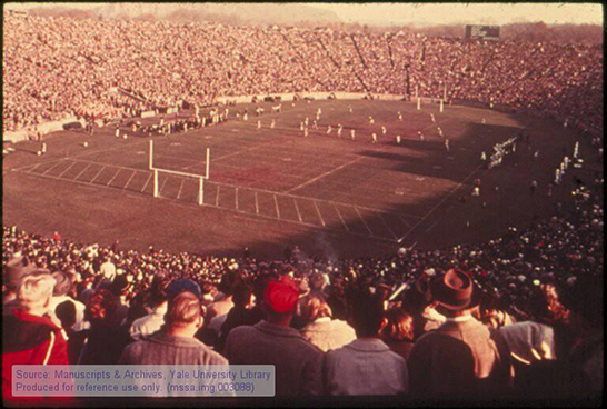
The basic structure and iconography of the emblem fell into place quickly. We knew that we wanted to feature the portals—the way the view expands as you pass through the dark tunnels, revealing the gridiron and the seating in full light—an experience almost unique to the Yale Bowl and so memorable to fans.
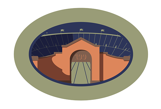
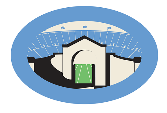
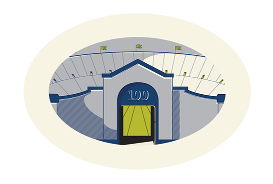
The graphic style was trickier to figure out. Initially, we tried to create a very strong vintage feel, heavily influenced by early 20th-century commercial illustration, featuring rich, complex colors and close values. But this style would have been challenging to apply to the range of sizes in which and materials on which the logo will appear.
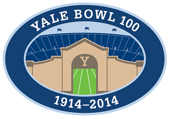
Making many, many variations of the logo, we pared down the drawing style and color palette to what you see here—simpler to use and more contemporary in appearance.