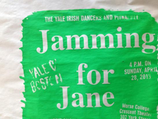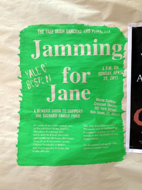
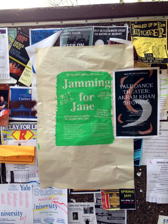
I saw this screenprinted poster on Cross Campus this morning. It’s eyecatching for obvious reasons: it’s neon green and enormous (and presumably violates the 8.5x11” size limit on posters):
Though it’s not typographically rigorous (multiple typefaces and sizes, several alignments, uneven spacing, uneasy relationships between type and margins), the piece succeeds in part because of its strong typographic hierarchy. There’s an unambiguous title (“Jamming for Jane”), distinct small text (confined to the bottom half of the page), and text that is intermediate in both size and importance.
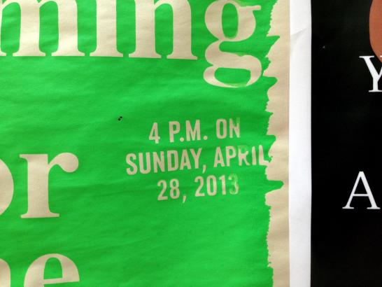
The evidence of the handmade in this poster is part of what makes it appealing, but more consideration could have been given to craft. There are many instances where ink has bled into smaller sized letters, rendering them nearly illegible. Both heavy and low ink coverage at the edges of the poster have caused a ragged edge and something like reticulation where ink has pooled on top of itself. While this messy, playful style is certainly its own kind of visual language—and one that can be used to great effect—it feels slightly inappropriate for the content of this poster, which seeks to advertise a fundraising concert for a victim of the Boston Marathon bombings. That said, we can all appreciate the amount of labor, time, and hand work that went into the design and production of these posters. It’s great to see that someone gave so much consideration to such an ephemeral medium!