Hi everyone! Forgive our long absence—we’ve been very busy. I plan to share some of the office’s projects in the next few posts.
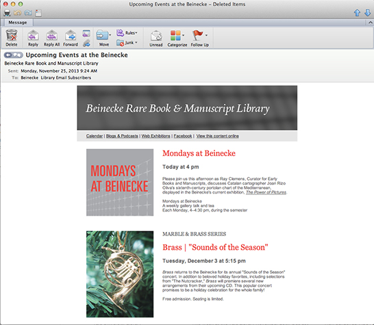
Recently, the Beinecke Library expressed a need for greater formatting flexibility in its e-newsletters in order to publish an increasingly wide range of content.
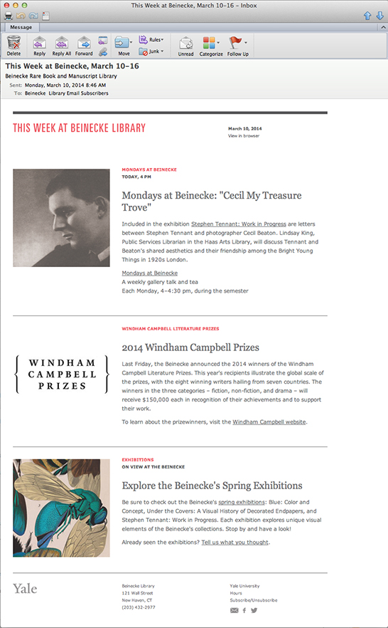
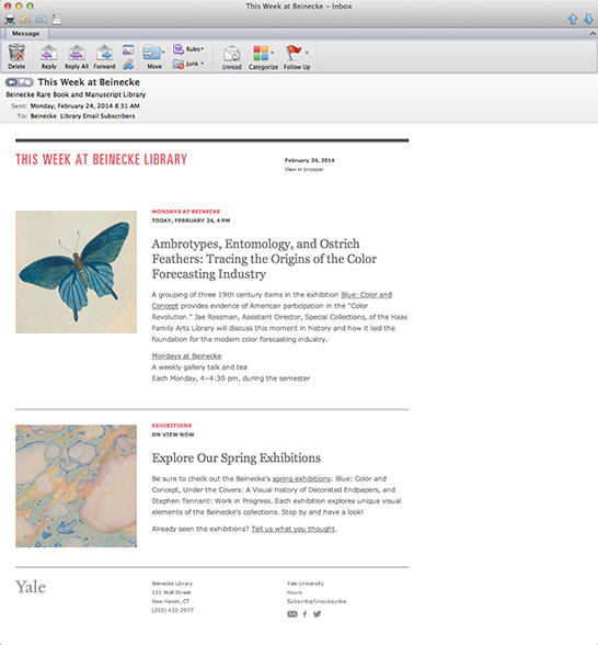
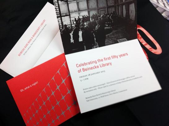
In the course of addressing this request, Rebecca and I also brought the style of the newsletter in line with the typographic identity that had been established for the Beinecke’s 50th anniversary celebration, elements of which have been retained as the basis of its institutional identity.
The new Beinecke e-newsletter is branded by the typography in the title bar and by a unique color palette—featuring Beinecke’s “proprietary” Univers Ultra Condensed headings and the accent color Pantone Red 032. These are the primary design components that would be customized in e-newsletters adapted for use by other Yale organizations.
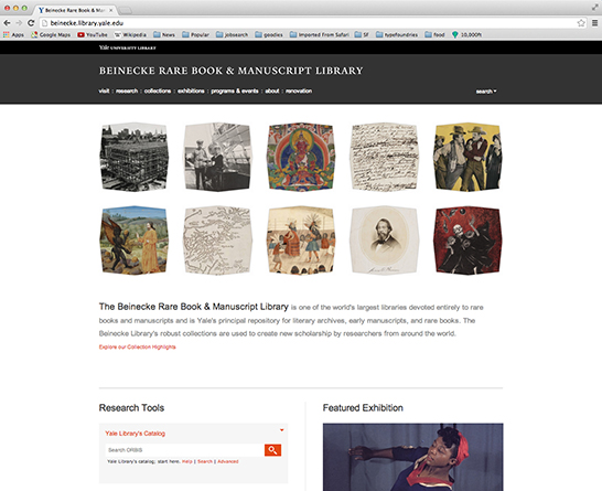
The strongly gridded style of the Beinecke’s Web site inspired us to design the e-newsletter template around a grid of square units, reserving substantial quantities of white space. Some of Yale’s most appealing e-newsletters—the Yale University Art Gallery for instance—employ a similarly gridded style.
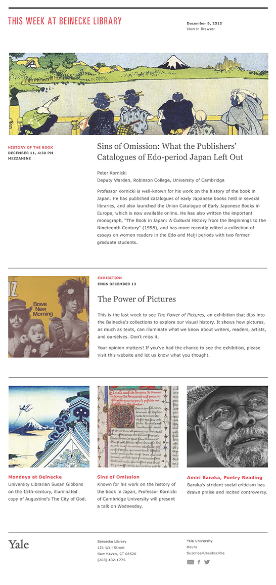
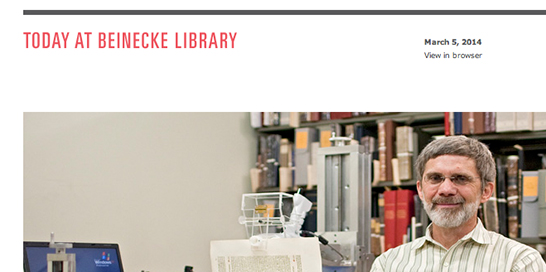
The “kit of parts” we developed permits greater control over content hierarchy and gives users more flexibility in matching various content types—short and longer-form stories, images, etc.—to suitable visual formats. We sought to make these functional and aesthetic changes in such a way that other branches of the Yale University Library system and other organizations around campus would be able to implement these upgrades.
You can subscribe to the Beinecke’s redesigned e-newsletter here.