Y Design Blog
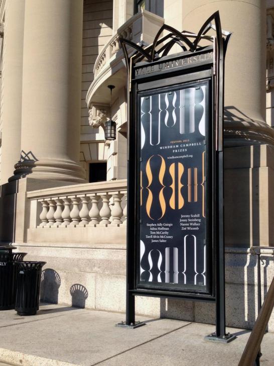
Have you noticed a proliferation of orange, white, and black brackets around campus? They’re part of the Pentagram-designed identity system for the Donald Windham-Sandy M. Campbell Literature Prizes. These prestigious prizes provide unrestricted grants to support writers of fiction, non-fiction, and drama. The first-ever winners were announced in March; the prize ceremony and celebratory festival will take place from September 10–13, 2013.
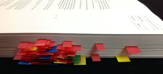
The Office of the University Printer is most closely associated with graphic design, but there’s another aspect of our work for the University: we provide editorial services as well. Our most important editorial project is the Bulletin of Yale University, the annual series of seventeen publications detailing the policies and programs of Yale College, the Graduate School, the professional schools, the Institute of Sacred Music, and the MacMillan Center. Work on the series begins each January and continues through the summer, as new information is solicited, queries addressed, and inconsistencies resolved. Editors review spelling and grammar, of course, but a surprisingly significant amount of time is spent fact-checking. Are book titles and publication dates accurately cited in a faculty profile? Is an organization’s name correctly configured? Are the many lists in the Yale College viewbooks for prospective freshmen up-to-date?
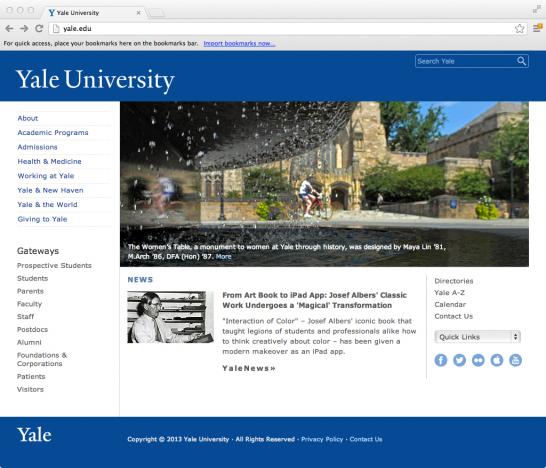
Have you looked at Yale’s web front page recently? You might have noticed that it received a subtle facelift.
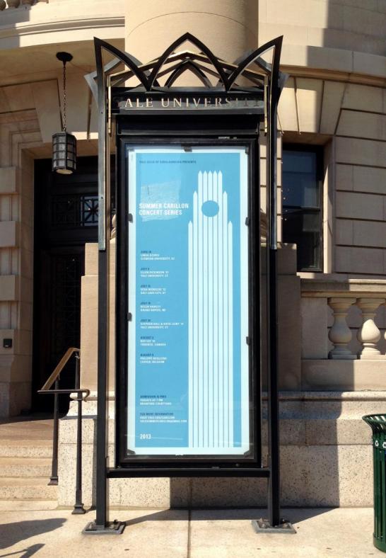
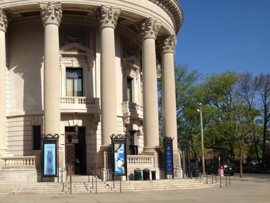
There’s a great new poster outside of Woolsey Hall. It advertises Yale’s Summer Carillon Concert Series, which features current and alumni guild members as well as carillonneurs from all over the world.
The poster’s visual language evokes Yale’s own graphic identity: its design is simple in its adherence to a single alignment scheme and uses a minimal amount of variation in text styles to differentiate types of information, and the shades of blue, though not “official Yale,” feel appropriately bright for the seasonal context and content of the poster.http://yalecarillon.org/
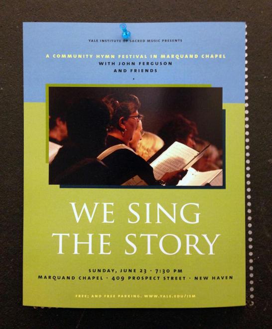
This is a poster for an Institute of Sacred Music concert. The design is understated but thoughtful: it showcases careful typography (old style figures, letterspaced small caps, minimal variation in type styles and sizes, attentive spacing around bullets, etc), an elegant color palette, and compositional consideration.
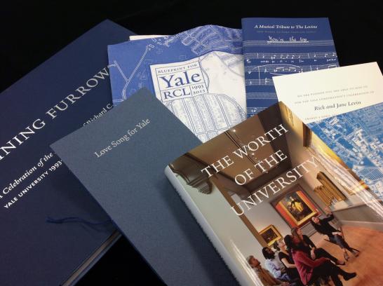
Our office designed a number of items in honor of Richard C. Levin’s twenty-year Yale presidency. The most significant of these was ‘Shining Furrows’: A Celebration of the Presidency of Richard C. Levin, a picture book with timeline that documents many of Levin’s achievements as president. ‘Shining Furrows’ was a major project comprising significant editorial, design, and coordinative work by our office. The content-gathering team included contributors from many departments across the University, and we enlisted designers Julie Fry ‘92, MFA ‘00, and Jessica Svendsen ‘09, MFA ‘13, to help drive the design side of the project.
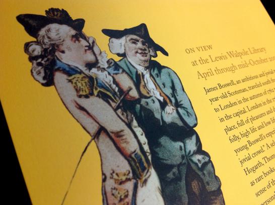
Rebecca designed print and exhibition graphics for the exhibition currently on view at the Lewis Walpole Library. The exhibition “In the Midst of the Jovial Crowd” focuses on eighteenth-century biographer James Boswell’s travels in London from 1762 to 1763. His exploration of the city’s lively culture is well-documented in his London Journal.
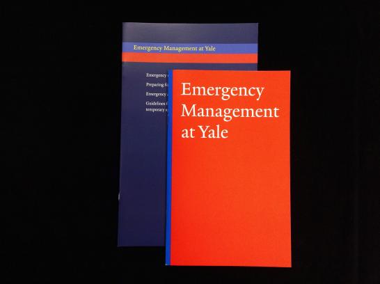
When the Office of Emergency Management needed a new brochure in 2011, our office was called upon to redesign what was originally presented to us as a Word document. My first redesign resulted in the guide shown below. Bright orange-red and blue became a “color identity” for Emergency Management, appearing as signature colors on their website and on promotional posters and cards.
Congratulations, class of 2013! We designed four posters to celebrate. They’re hanging in the vitrine cases outside of Woolsey Hall at the corner of College & Grove streets.
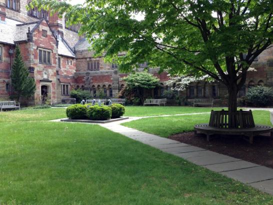
Have you ever looked closely at the stone carvings that decorate the Selin Courtyard in Sterling Memorial Library? If you’ve never visited the courtyard, it’s worth a trip. Find it by taking a right at the circulation desk after coming through the main entrance on High Street (the door will be on your right), or enter through the Wall Street entrance, walk down the corridor, and go through the door on your left.
