Please forgive our extended absence, but the office has been busy working on several projects that will be shared in the next few posts.
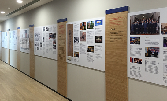
For most of September and October, John, Lesley, and I worked on the design of a history mural that went up in the new Yale Center Beijing, which opened October 27.
The timeline spans more than 40 feet and almost two centuries, chronicling Yale’s relationship with China since 1835, the year Yale graduate Peter Parker established an Ophthalmic Infirmary in Guangzhou.
Working with the Office of International Affairs and the Yale-China Association, we assembled more than 60 images for the project, in addition to editing 80 text entries, which are rendered in both English and Chinese.

In order to make a piece that honored Chinese design traditions and Yale branding, we sought typographic advice from prominent Chinese designer and Yale School of Art alum Min Wang. He recommended a typeface with simplified characters that would complement the design of the Yale typeface. After considering a few options, we selected STHeiti. We incorporated colors considered more auspicious in Chinese culture—grays, red, and gold—in addition to placing “capitals” of blue atop the dividing wood columns.
Min Wang also designed a handsome wordmark that fuses Chinese lettering with the Yale typeface and official Yale colors. This design may serve as a model for future bilingual branding of Yale facilities and projects around the world.

Our office oversaw design and printing of the text and images in Connecticut and observed the project’s installation from afar. Vinyl texts mounted on wood panels—the latter specified by the architects—introduce the theme of each section of the timeline, in addition to adding an element of three-dimensionality and vertical movement.

After two months of planning and preparation, the project was completed in time for the center’s opening ceremony.
