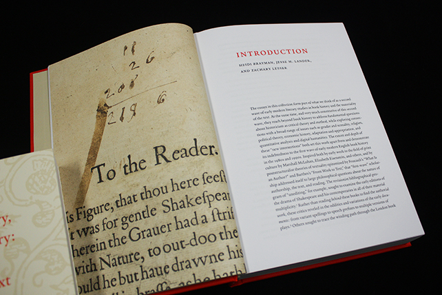
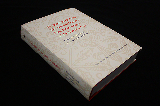
This past spring, we designed The Book in History, The Book as History, a collection of essays by eighteen leading scholars in early modern literary studies that explore book history and the material text. Published by the Beinecke Rare Book & Manuscript Library and distributed by Yale University Press, the 420-page volume features 60 color illustrations and will be available this August.
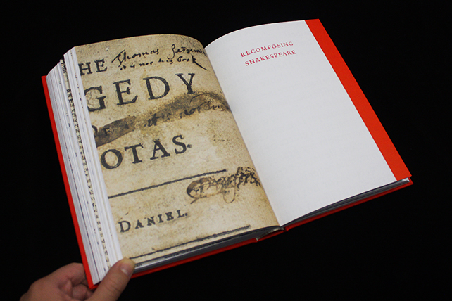
The book was designed by Rebecca Martz, our publications specialist, and copyedited by Lesley Baier, our editor. Most of its illustrations showcase original materials from the Beinecke’s collections; each essay begins with a full-bleed detail of a relevant object and features additional illustrations throughout. Similarly, each thematic section of the book begins with a full-bleed image, as well as a bright red edge on the facing page. All of the book’s major headings, including the essay and section titles, appear in the same red color. The entire book was appropriately typeset in the Yale typeface, not only because of the book’s connection to the Beinecke, but also because “Yale” is an old-style typeface; typefaces of this kind emerged in the late fifteenth century and dominated the printed texts of the Renaissance era.
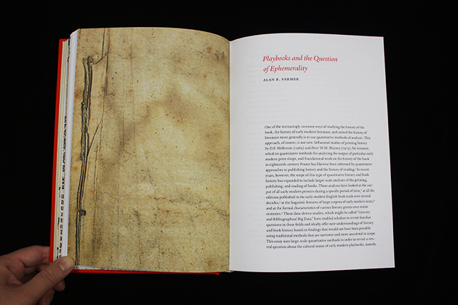
Each essay opens with a full-bleed illustration.
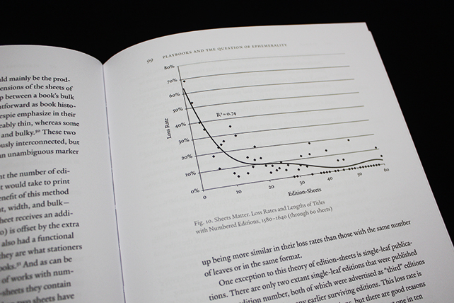
One of the essays features nine graphs and tables. Their apparent simplicity belies the extent to which they were a design challenge.
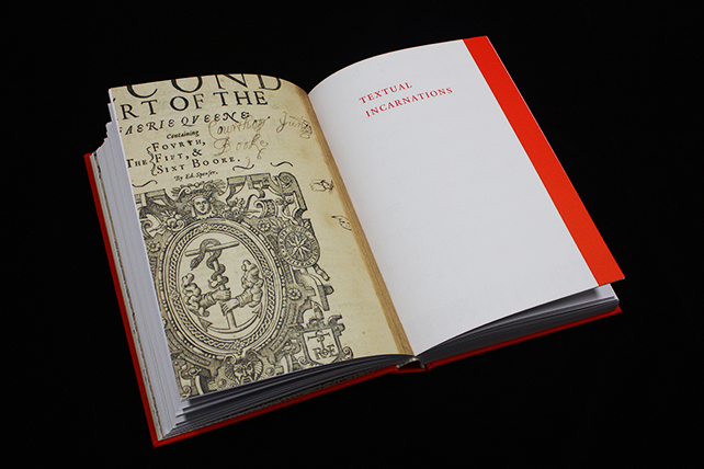
The opening spread of one of the thematic sections.
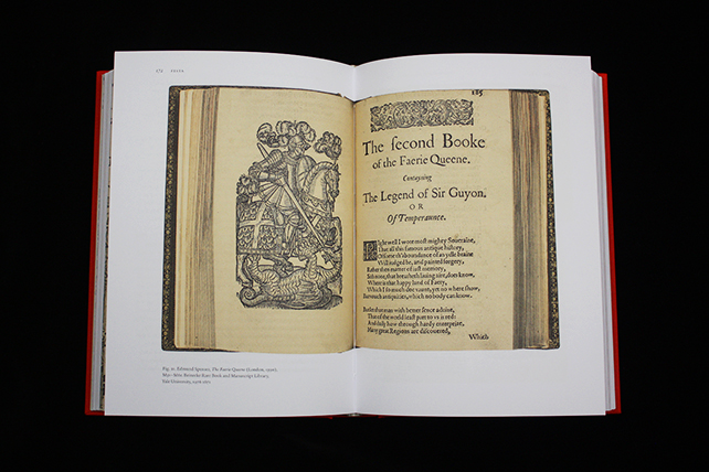
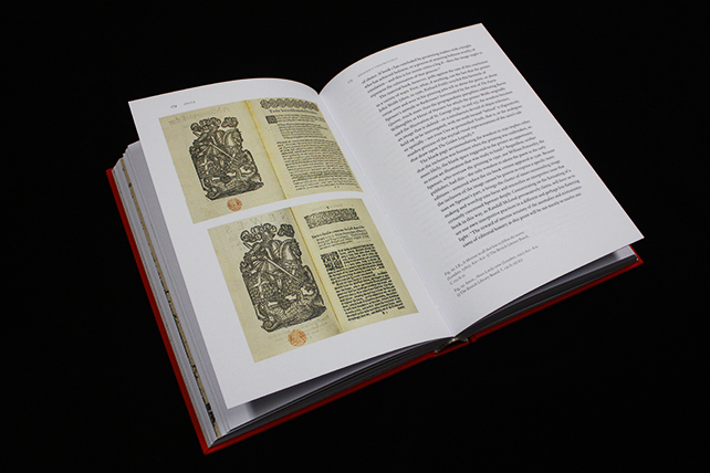
A full-spread illustration in one of the essays.
In April, Rebecca oversaw the book’s printing at EBS Editoriale Bortolazzi Stei, a respected printing company in Verona, Italy, that dates back to 1953. The book was printed on a KBA Rapida 105, a sheet-fed, medium-format offset press, on Fedrigoni papers. While guiding adjustments on press to ensure color accuracy, Rebecca encountered interesting differences in European versus American standard CMYK inks, most notably with the yellow ink.
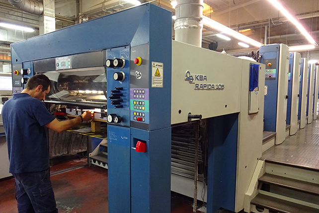
The KBA Rapida 105 on which the book was printed.
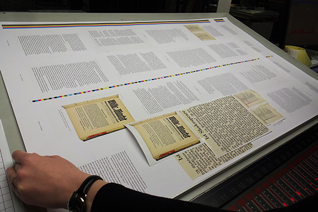
Rebecca checking a printed sheet against loose image proofs for color accuracy.
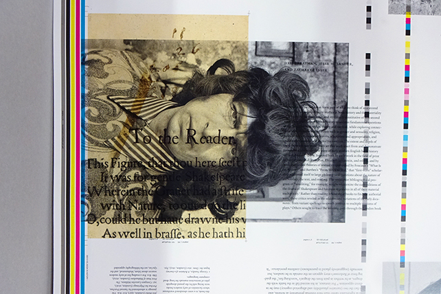
An example of a “make-ready” sheet. During the press adjustment process (alignment, ink quantities, etc.), press operators often used waste sheets from other jobs in the plant while making the forms ready for approvals.
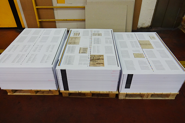
Freshly printed sheets ready to be trimmed and bound.
The wide-release paperback edition, which has a printed cover with flaps, features debossing on the front cover and spine. For the limited hardcover edition, Rebecca chose book cloth in a bright red shade to match the red ink that appears throughout the interior, as well as light tan and white striped head and tail bands to complement the book jacket and endsheets. The hardcover edition also features gold foil stamping on the front cover and spine.
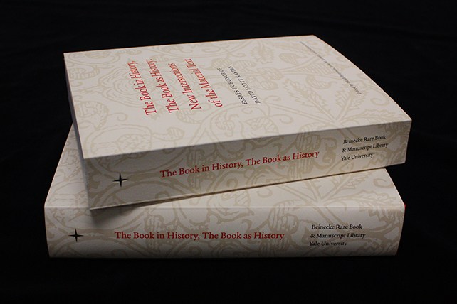
The paperback and hardcover editions of the book.
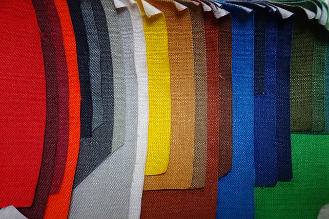
Some of the book cloth options at EBS.
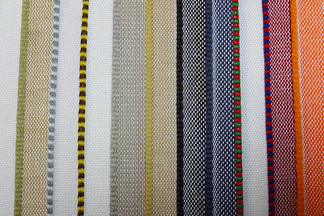
Some of the head and tail band options.
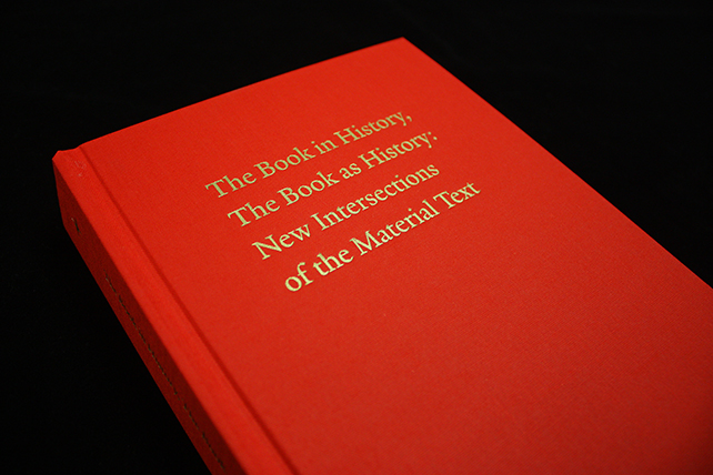
The gold foil stamping on the hardcover edition.
After numerous proofs and many days of fine-tuning at EBS, the book was finally ready for production! Congratulations to Rebecca for designing a nuanced volume that so vividly showcases the materiality of the texts in question.