Today I stopped by the Yale Center for British Art and the Yale University Art Gallery to check out two very different exhibition designs.
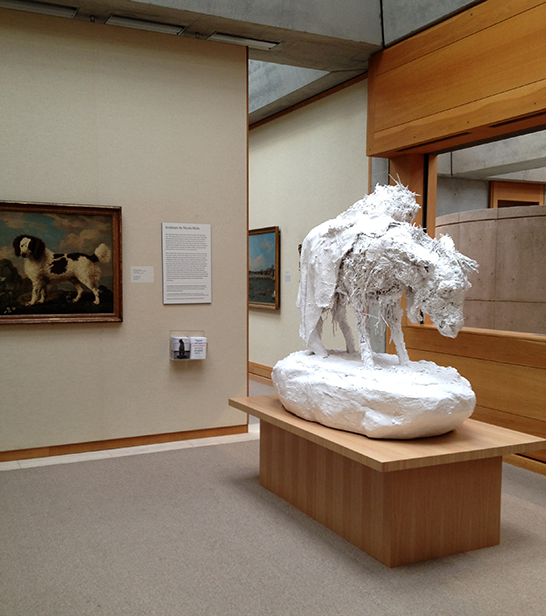
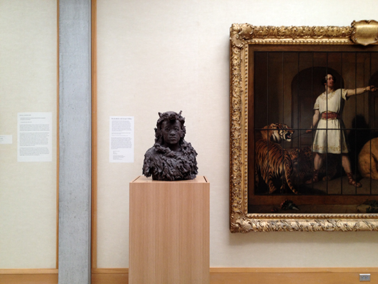
At the YCBA, the pieces in Sculpture by Nicola Hicks are installed among paintings selected by the artist from the museum’s permanent collection.
The labels and exhibition graphics reflect this quiet integration.
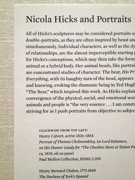
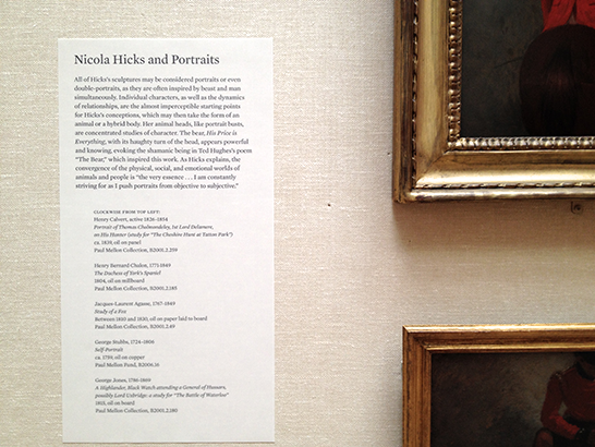
Labels that describe Hicks, her work, and its connection to other British art adhere to the standard formatting used throughout the rest of the YCBA.
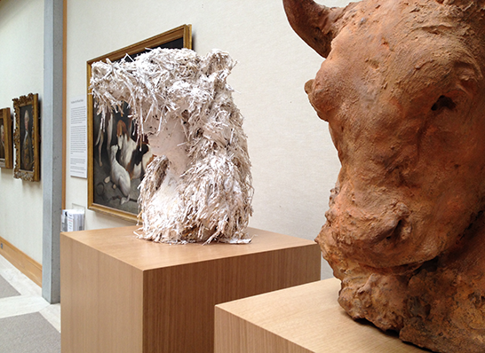
This exhibition design strategy waits in the background. The viewer decides whether to consider Hick’s sculpture in the context of the adjacent artwork and label information.
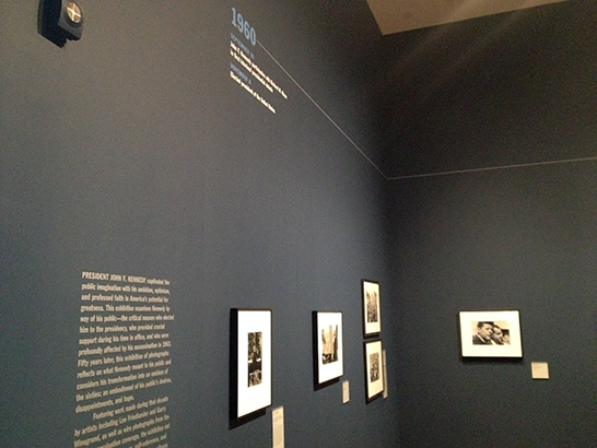
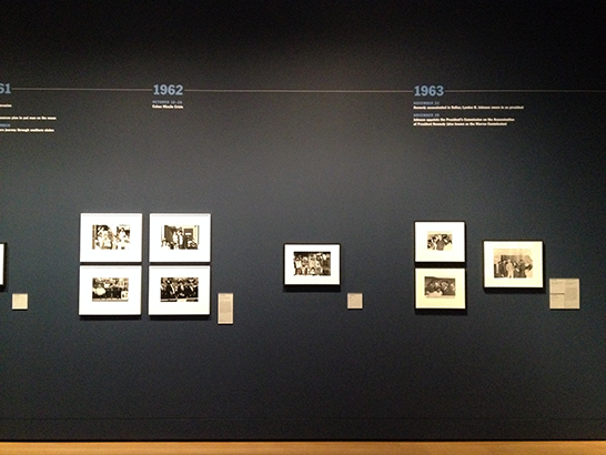
Across the street, the exhibition design for A Great Crowd Had Gathered: JFK in the 1960s inserts itself boldly into the viewing experience.
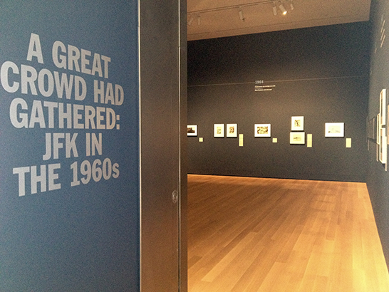
The blue-painted walls demarcate the exhibition’s physical space, separating it from the rest of the gallery.
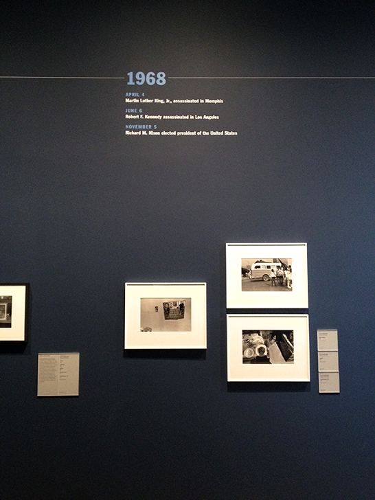
The large timeline organizes the photographs around related events in presidential history and popular culture. The timeline, labels, and groupings together exert nearly the same visual weight as the images themselves, unequivocally drawing viewers to consider the photographs within their chronological and cultural context.