November 1, 2013

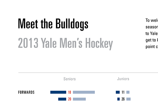
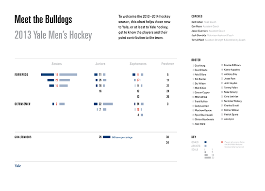
Since this Friday is the men’s hockey season home opener, I designed an information graphic that introduces the team, each player’s position, and his point contribution to the team.

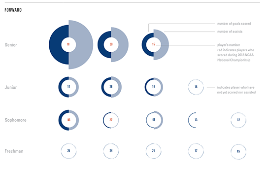
It was challenging to express this quantity and variety of data in a clear and compelling manner. I first tried organizing the data in concentric circles around each player’s number. Although intriguing, the design did not use space efficiently—it repeated labels and overcomplicated the reading of the graphs.

The final linear model organizes the data more concisely around shared axes and eliminates redundant information. It also makes evident broader observations, such as that the team consists predominantly of new players and underclassmen.