I’ve noticed a number of striking student-designed posters around campus in the past month or so. The posters, seen below, are distinguished by their strong use of image with type (in some cases, the type itself is the image) and the presence of negative space (type and image alike have plenty of “room to breathe”). Obvious editorial consideration—the distillation of information down to its most essential elements—allows color and form to dominate the page, making for effective advertisements.
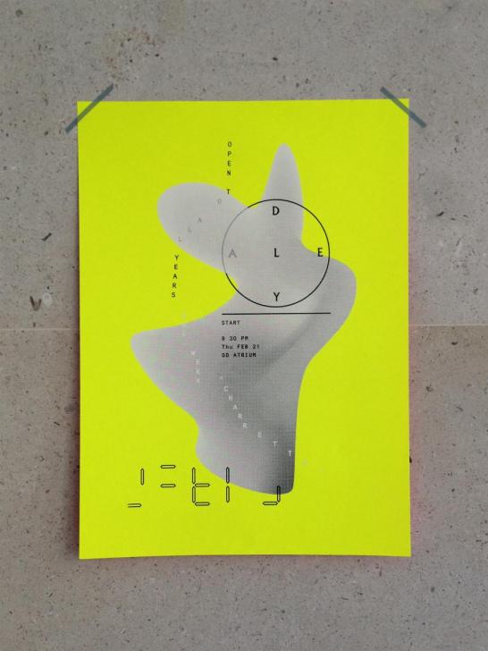
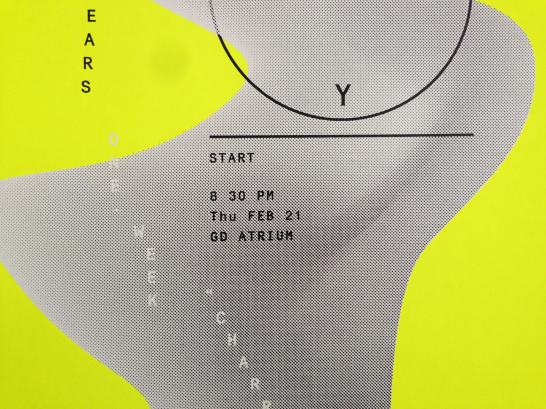
Above: School of Art lecture poster. Seen in Green Hall, 1156 Chapel Street.
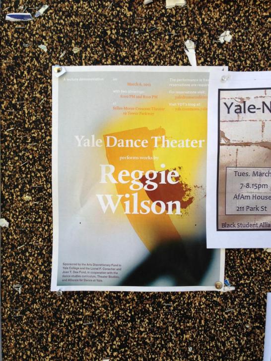
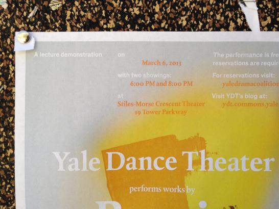
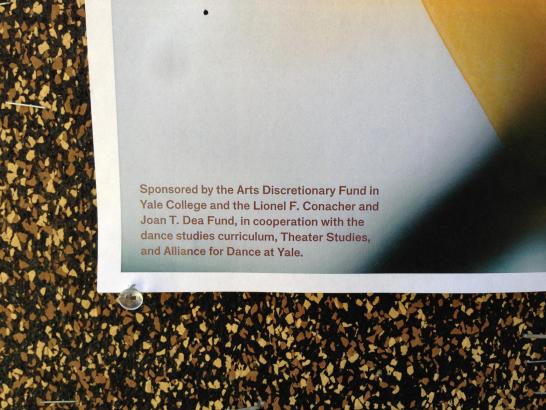
Above: Yale Dance Theater poster. Spotted on a Cross Campus bulletin board.
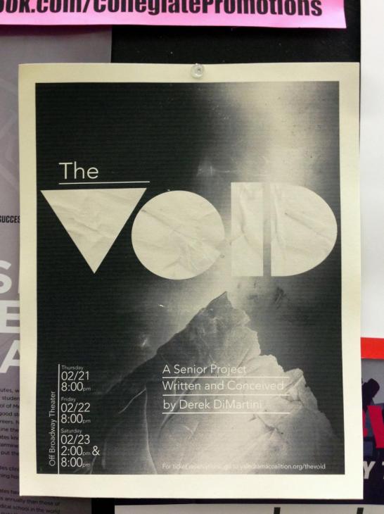
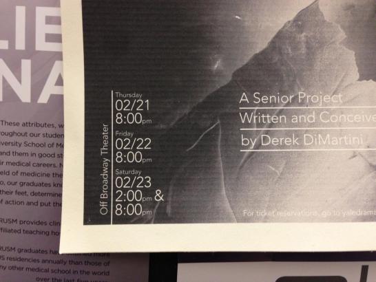
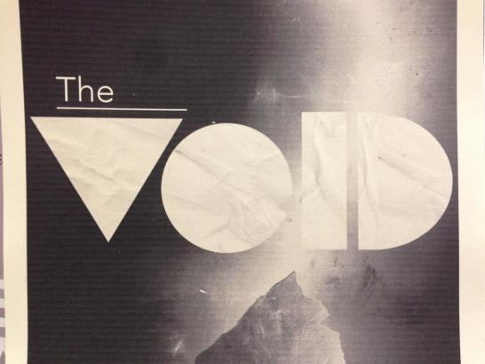
Above: The Void senior project poster. Seen at Yale Station.
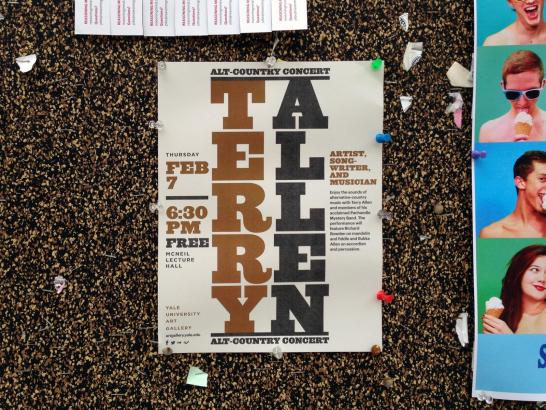
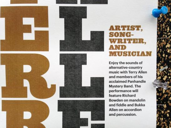
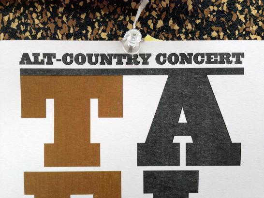
Terry Allen at Yale University Art Gallery poster designed by Jessica Svendsen. Seen on Cross Campus.