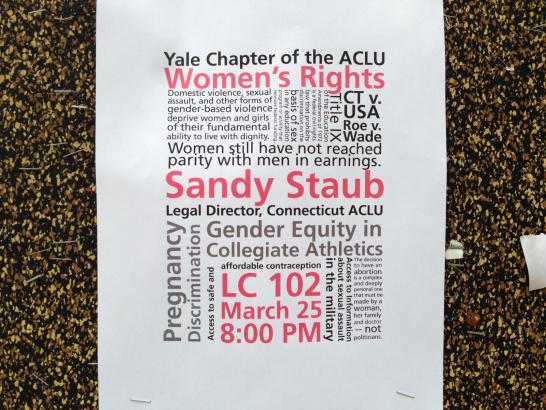
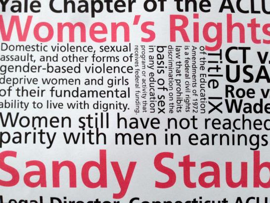
I saw this red and black poster for the Yale chapter of the ACLU on a Cross Campus bulletin board this morning.

The densely packed type arranged in a rectangular composition immediately reminded me of Carson Evans’ winning poster design for the Van Sinderen Book Collecting Prize—her poster and today’s ACLU poster place chaotic type inside an ordered form.

Neither of these posters adheres to traditional typographic conventions: multiple point sizes and weights of type are used (sometimes in the same sentence), tight leading makes individual lines difficult to read, and there is no consistent adherence to alignment axis. Despite—or because—of this, both posters are eye-catching in their reliance on typography and color alone to draw and hold attention.
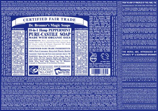
Dr. Bronner’s castile soap label is a classic example of similar typographic texture used to great effect. The parameters for design are even more limited: only two colors are used and only two alignment schemes are present. This composition relies on minimal negative space and on relative scale/size of type to create a hierarchy of information.

Image courtesy of drbronner.com.
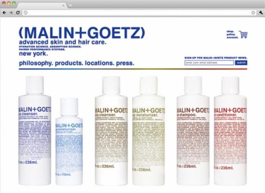
2x4’s identity and packaging design for skincare company Malin+Goetz also uses typography to create a distinctive texture through diminishing weight and through color.

Image courtesy of 2x4.org.
It’s fascinating to see how a similar concept can be taken in such different directions even within a strict set of design parameters.