“White Cube Green Maze: New Art Landscapes” is on view at the School of Architecture right now. The exhibition closes tomorrow, so be sure to check it out this weekend while you still can!
When you walk into the exhibition space at 180 York Street, you’re greeted by a striking facade with a doorway cut out:
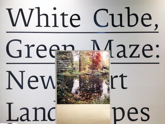
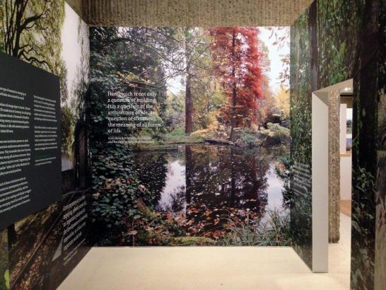

The entry “cube” immerses the viewer in an environment that serves as a dramatic entry point to the rest of the exhibition.
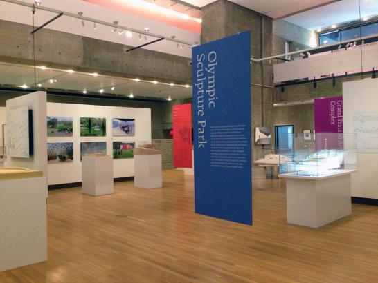
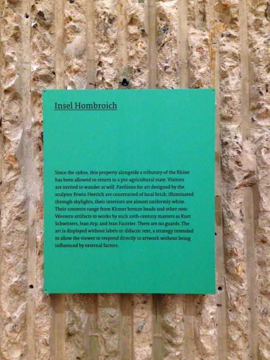
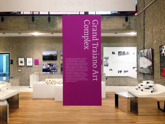
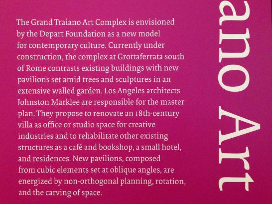
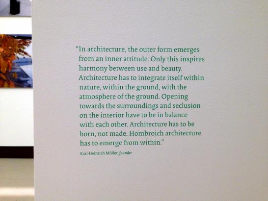
mgmt. design’s thoughtful exhibition graphics are worth consideration in their own right. It’s great to see such attention to typographic detail—hanging punctuation, careful rag adjustment, fairly tight leading with tight wordspacing (which together make for a highly legible line)—combined with a sense of play. Color and scale variance for all of the signage keeps the show’s graphics looking cohesive but never boring.
Learn more about Yale School of Architecture’s exhibitions on their website.