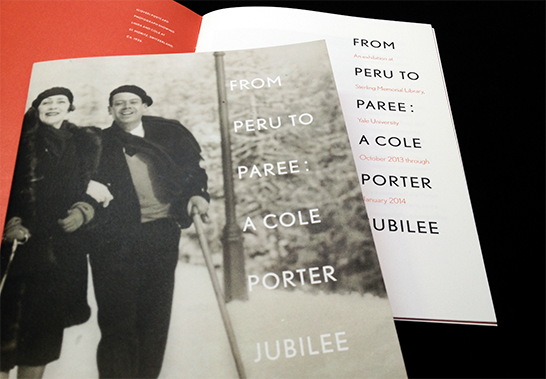
For an upcoming exhibition about Cole Porter, we selected a typeface that would reference the visual context in which he worked—Art Deco—without looking like a document from that time.
We used Nobel types for this project. Originally inspired by Futura (the quintessential Deco face), and designed in 1929, Nobel was expanded and updated in the 1990s by Yale School of Art Critic Tobias Frere-Jones.
Our reference to the Deco style, which began with this typeface choice, is also evident in other aspects of the design, such as the tall narrow arrangement of the titling type, captions, and text blocks.
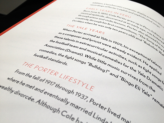
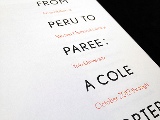
Nobel presented unique challenges in typesetting. The regular text weight font is unusually heavy. In order to create enough hierarchical difference between titles and text, we decided to set the section headings in the extremely fine, light version of the font. While this treatment contradicts typographic convention (setting headings in heavier weights than that of body text), inverting this wisdom, and incorporating the red accent color, seemed to create an appropriate hierarchical distinction in this instance.