The Office of the University Printer worked closely with the Office of Student Financial Services (SFS) on the redesign of Yale’s financial aid letter, which was mailed to the early action admits of the class of 2020 back in December; see the story in the Yale Daily News. Regular decision admits will be receiving the new letter in just over a month.
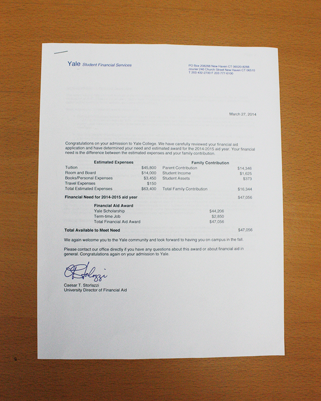
The previous letter was an all-in-one document that contained a brief introductory message followed by financial information. Additionally, the entire letter was set in Helvetica and therefore did not have a proper Yale letterhead.

The old letter
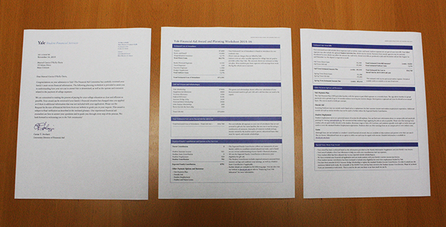
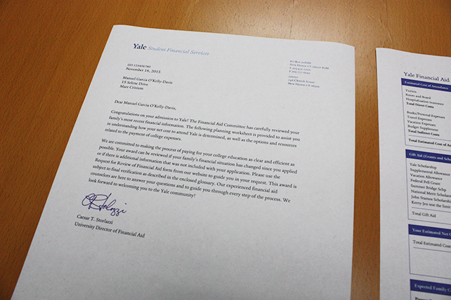
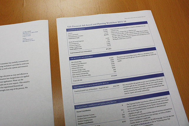
One of our primary recommendations was to split the financial aid letter into two parts: a formal letter printed on Yale-watermarked paper with a proper Yale letterhead and salutation, which the previous letter lacked; and a double-sided worksheet containing all of the financial details. At the suggestion of SFS, we partitioned the financial information into a series of discrete, clearly labeled boxes. Most of the boxes have two columns, with the left column containing various figures and the right column containing a bulleted explanation of those figures.


The new, two-part letter
The result is a letter that is both more attractive and easier to comprehend. Although we had to make a few design adjustments for compatibility with the software that allows SFS to send out thousands of letters, we believe that the document now truly looks like “Yale.” It is the result of months of hard work on the part of SFS, the Office of Undergraduate Admissions, the YCC, and others to make Yale’s financial aid decisions more intelligible to students. It also embodies our general mission to improve Yale’s communications both visually and editorially. And much to our delight, the letter is now set entirely in the Yale typeface.