Y Design Blog
Today I stopped by the Yale Center for British Art and the Yale University Art Gallery to check out two very different exhibition designs.
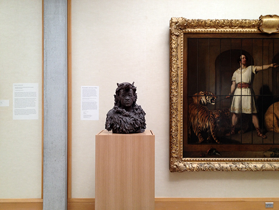
At the YCBA, the pieces in Sculpture by Nicola Hicks are installed among paintings selected by the artist from the museum’s permanent collection.
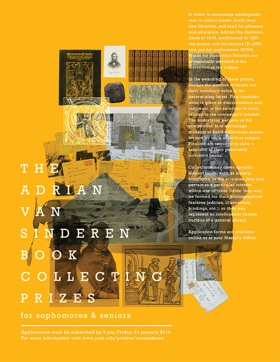
In order to encourage undergraduates to collect books, build their own libraries, and read for pleasure and education, Adrian Van Sinderen YC 1910 established two prizes—one for seniors and one for sophomores—in 1957.
Special thanks to Edward Wang TC ’16 for designing the winning publicity poster. An honorable mention was awarded to Ava Tomasula y Garcia CC ’17. Learn more about the Van Sinderen poster competition here.
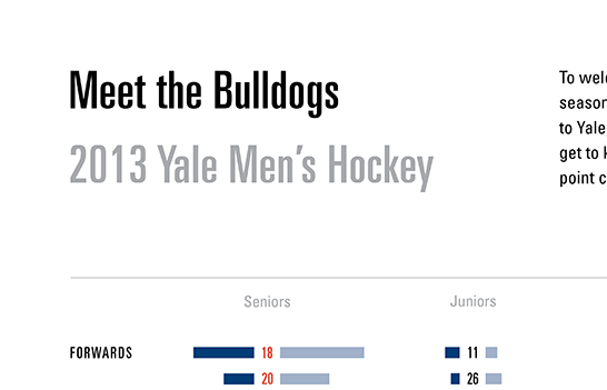
Since this Friday is the men’s hockey season home opener, I designed an information graphic that introduces the team, each player’s position, and his point contribution to the team.
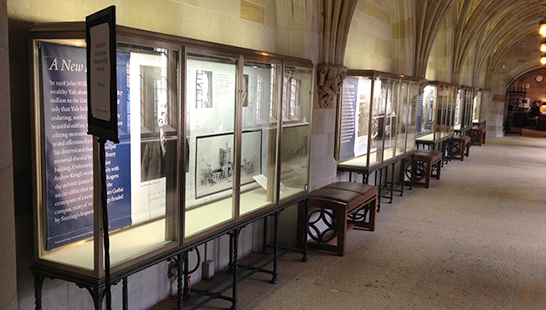
In the Sterling Memorial Library for the exhibit corridor—one of the few places not covered in scaffolding and temporary walls—Chika designed a series of panels that describe the library’s history and current renovation project.
A grid system maintains order among the varied elements in each panel. Its consistent structure also ties the fives cases together, especially important given the distance between them.
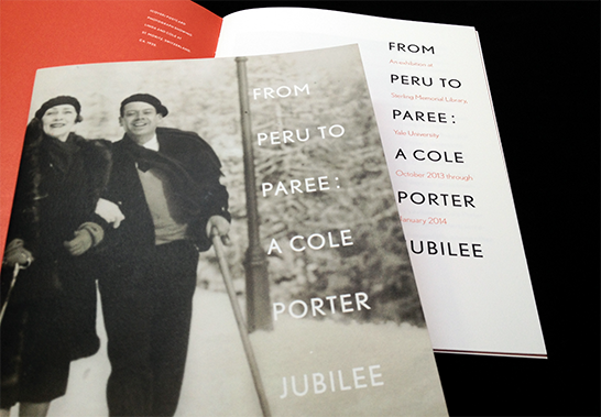
For an upcoming exhibition about Cole Porter, we selected a typeface that would reference the visual context in which he worked—Art Deco—without looking like a document from that time.
We used Nobel types for this project. Originally inspired by Futura (the quintessential Deco face), and designed in 1929, Nobel was expanded and updated in the 1990s by Yale School of Art Critic Tobias Frere-Jones.
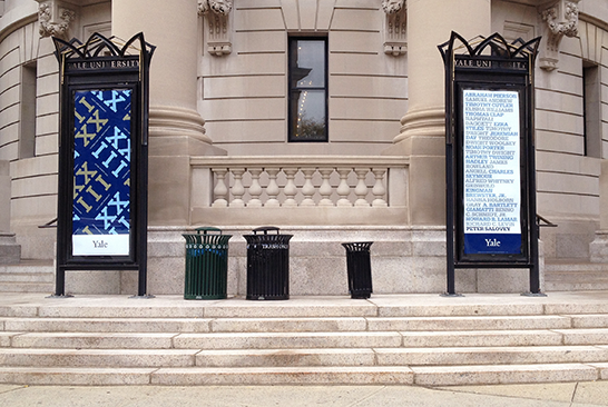
Last week I designed posters—now in the display cases in front of Woolsey Hall.
The objective of the project was to extend a cheerful welcome to Inauguration visitors while conveying simple messages about this celebration.
The diagonal tiling of the large roman numerals, XXIII, serves as a decorative “attractor,” and the much smaller “Celebrating the Inauguration of…” that runs between them provides informational payoff at close range. The “23” has been used in a variety of decorative typographic forms for President Salovey’s Inauguration communications and keepsakes.
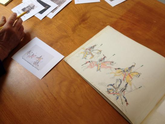
The printer’s proof (left) looks pinker than the sketchbook drawing (right), by Kiowa artist Zotom depicting a horse parade.
This proof, of a page from Beinecke’s hand-illustrated copy of Uncle Tom’s Cabin, is veryclose to the original. Nevertheless, excess magenta ink simultaneously makes the color of the cloud more purple and the paper less yellow.
A designer’s job does not end when he/she sends project files to a printer. During production, designers and printers work together to ensure that every aspect of a project is produced to a high standard. Currently, our office is working on the book for the final installment of Beinecke Library’s exhibitions celebrating its 50th anniversary.
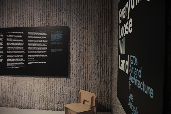
Everything Loose Will Land is on view now through November 9 in Paul Rudolph Hall. The exhibition features pieces of art and architecture (often in-process works and sketches) that embody the relationship between art and architecture in 1970s Los Angeles. The exhibit comes to Yale from MAK Center for Art and Architecture at the Schindler House in Los Angeles.
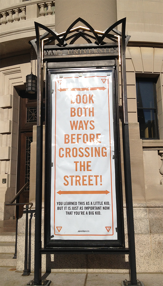
The most recent poster (above) installed outside Woolsey Hall—a plea for pedestrian safety by New York artist Jason “Jay Shells” Shelowitz—stands in contrast to the usual pieces of arts publicity in neighboring display cases. The poster appears to be the latest addition to an ongoing effort by the Yale Traffic Safety Subcommittee to encourgage safer pedestrian behavior on campus. Smaller versions of this poster mark many of the street corners on campus, while spray-painted signs reading, “Don’t read this, look up” mark others. Jason Shelowitz has received attention for his unofficial MTA subway notices encouraging New Yorkers to show greater courtesy while riding the subway. If you have not passed by the display cases lately, I would recommend stopping by! The bold typography and use of striking orange both catches the eye and delivers ever-useful advice.
“In the summer of 1980, between my first and second years of Art School, I worked part time for the Yale University Printing Service, housed then at 149 York Street, the current site of the DMCA.
Akefeh Nurosi, MFA ‘80, was working there that summer as the full-time summer Rollins Fellow. She was the latest of approximately 30 MFA students who had, two or three at a time, worked with Greer Allen, the University Printer, to produce the day-to-day design work of the University since 1970. This was a win-win initiative: Yale University’s administrative publications benefitted from the talents of graduate art students, and those students benefitted from working for Greer and from serving Yale clients with high expectations of the work of the Printing Service.