Y Design Blog
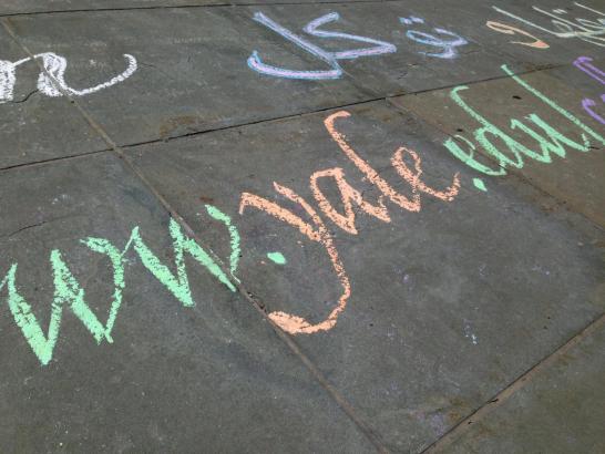
Have you seen the calligraphy in front of Sterling Memorial Library? Go check it out before the rain washes it away!
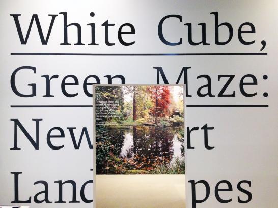
“White Cube Green Maze: New Art Landscapes” is on view at the School of Architecture right now. The exhibition closes tomorrow, so be sure to check it out this weekend while you still can!
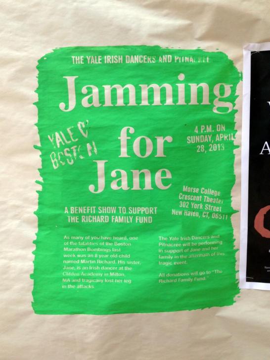
I saw this screenprinted poster on Cross Campus this morning. It’s eyecatching for obvious reasons: it’s neon green and enormous (and presumably violates the 8.5x11” size limit on posters).
This year’s Lohmann Prizes were chosen last Friday. The Prizes, which celebrate excellence in undergraduate printing and design, were awarded to eight students. All of the judges noted that this year’s submission pool was particularly strong. We had a hard time choosing the winners!
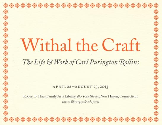
For the past year, I’ve been spending time in Special Collections at the Haas Family Arts Library researching the life of Carl Purington Rollins, Yale’s first University Printer. The result of that research is now on view in the exhibition space in Haas in the form of an exhibition called Withal the Craft: The Life and Work of Carl Purington Rollins.
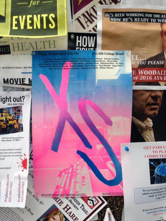
This bright poster caught my attention as I walked across Cross Campus this morning. Its neon colors (and the gradients formed by their transitions) are unlike the familiar agglomeration of so many sheets of plain text on copy paper and photographic-toned images. It is perhaps the only poster on this bulletin board printed full-bleed (the color extends to [and, conceptually, beyond] the edges of the paper)—note how there’s no telltale white border around its edges, which marks most of the other posters as having been printed on standard letter-size paper likely off of a cluster printer. Most importantly, one compositional element dominates the picture plane: in large and roughly hewn lowercase, the letters “xs” dominate without explanation or apology. All supplementary information is relegated to small black text at the poster’s top and bottom margins. The designer was rightly confident that the poster itself would serve as a point of entry for the viewer.
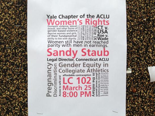
I saw this red and black poster for the Yale chapter of the ACLU on a Cross Campus bulletin board this morning.
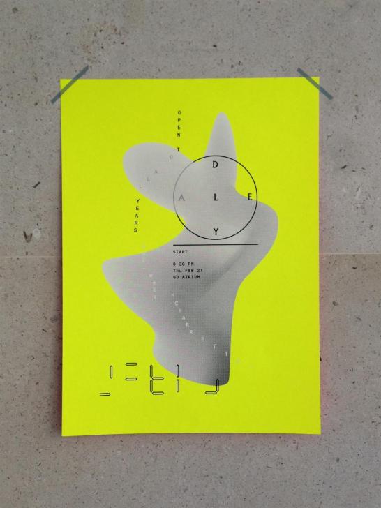
I’ve noticed a number of striking student-designed posters around campus in the past month or so. The posters, seen below, are distinguished by their strong use of image with type (in some cases, the type itself is the image) and the presence of negative space (type and image alike have plenty of “room to breathe”). Obvious editorial consideration—the distillation of information down to its most essential elements—allows color and form to dominate the page, making for effective advertisements.
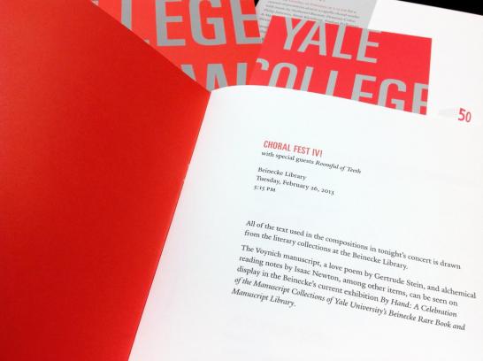
Our office designed the program and postcard invitation for Yale College New Music’s February concert, Choral Fest IV!. The concert, which featured special guest vocal octet Roomful of Teeth, was held in Beinecke Library as part of its 50th anniversary year celebrations.
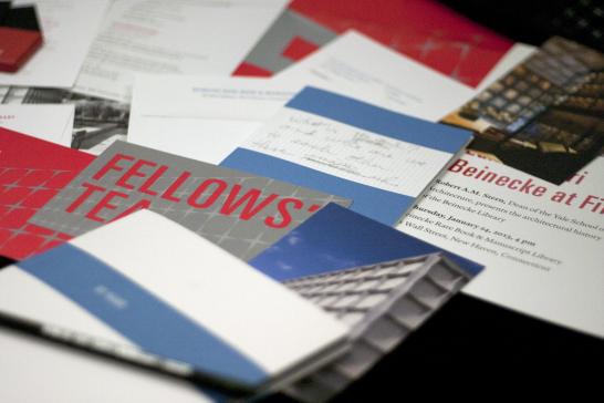
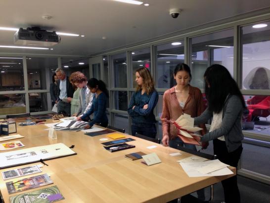
Y Design is alive and well! We’ve been very busy over the past two months with work for Beinecke Library’s 50th anniversary year and several other major projects that you’ll read about soon on this blog. Here are a few snapshots of our designs for Beinecke.